

An end-to-end app that focuses on helping users make decisions on what video game to play with their friends.
Overview
What if we explored ways to help gamers feel less pressured when trying to decide what games to play with their friends so they can save time.
Researcher
UX Designer
My Role
Tools
Canva, Figma,
Maze,
Google Forms
Overall: 1 Month
Research: 2 Weeks
Design & Testing: 2 Weeks
Timeline
Background
Ever since Covid, more people have been spending time with each other through online means. There’s so much that can be done, like watching movies and playing video games. The amount of options and added pressure of pleasing people can cause users to be indecisive and time is wasted trying to figure out what everyone wants to do.

So what’s the problem?
Many users have turned to online gaming to spend time with friends. There are so many options to choose from, and people have different tastes.
It’s hard to decide on a game the whole group can play.
How do we solve the problem?
We want to create an app that helps users decide what game to play based on preselected settings and majority rules. This is so users spend more time playing games over being stagnant and unsure of what to do.
Determining the Goals
User
Discover New Games: Users may want to explore new and trending games across different genres to discover titles they haven't played before.
Time Management: Users may want to find games to play immediately or make concrete plans with their friends without wasting much time.
Business
Market expansion: Create a brand new app with no direct competitors.
User engagement: the app can encourage frequent app usage by creating interactive features to keep users coming back.
User retention: this app could have features that retains users long term.
Discovery
Research
I wanted to gauge if this is something users would want/need as well as if they have any suggestions for the app. I also wanted to discover if there was similar apps in the market.
Goal
Determine if users need help choosing what to play with their friends.
Determine if users already have a similar method of choosing games with their friends.
Understand what users look for in similar apps.
Objectives

How might we help gamers relieve pressure from choosing games, so they have more time to play
Survey
To gauge the public’s general opinions and feelings about this potential app, a survey was conducted. 5 gamers submitted answers and these are the insights:

While answers were mixed, 80% of surveyed users said it was sometimes hard to choose games to play with friends.
All surveyed users showed a least some interest in using an app like this one.
All surveyed users say that play online games, and only 40% of them played games in-person.
Interview
I had a lot of doubt in the beginning stages of this app. I was mostly concerned if this was something people would want to use. In order to determine if my doubts were true, interviews were conducted. These are the key findings:

Users want more direction and less difficulty when it comes to choosing games with their friends.
Users want the ability to make more concrete plans with their friends.
Users want to have fun and connect with their friends without having to work hard deciding on a game.
Competitive Analysis
I mainly used the competitive analysis to determine if there was any gaps to fill in the market. I couldn’t find any direct competitors, so I used apps where the main goal was helping people make decisions.

Design & Ideate
For the users
Who are they?
I tried to include the key features that were discovered from real users during the research phase. This helped me paint a better picture in my mind of what users actually wanted, and who I was designing for. Not just something I would like to use with my own group of friends.

Meet Marcus, the self proclaimed pro gamer:
What features do they want/need?
Creating Lobbies
This will allow users to allow certain people to join and participate, as well as set pre-determined rules before the swiping/matching feature.
Swiping & Matching
This is the main focus of the app. Users are meant to swipe through games until there is a majority choice. That game will show up as a match.
Calendar
Users are able to use the calendar feature to make plans to play if they need to. This helps user stay organized and help them remember their plans.
The big picture
Since this project is created from end-to-end, I wanted to create a site map that allowed me to easily visualize possible site structures and page hierarchy.

How would they get there?
I had so many ideas floating in my mind, so I wanted to get all my ideas put down and together. This is when I created a user flow. I wanted to piece together how a user would/could navigate and use my app.

Initial Design
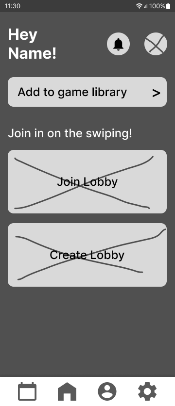
Wireframes
Low Fidelity Wireframes
I took inspiration from the features I saw during the competitor analysis and what was uncovered in the interviews and surveys. I tried creating a couple iterations for some of the frames, so I could play around until I found something that worked with the overall flow.
These are the key screens I made that showcase the features I tried to design for that fit the needs the users expressed during my research.


UI & Component Library
Since I typically work with lighter colors, I wanted to challenge myself to use darker colors. Dark colors imply a sense of sophistication, while blue has connotations with trust and wisdom. I wanted the app to have a techy modern feel to it as well. These colors also passed the WCAG AAA contrast ratio.
I also spent time creating a custom logo and some icons. This worked to give my app a brand identity.

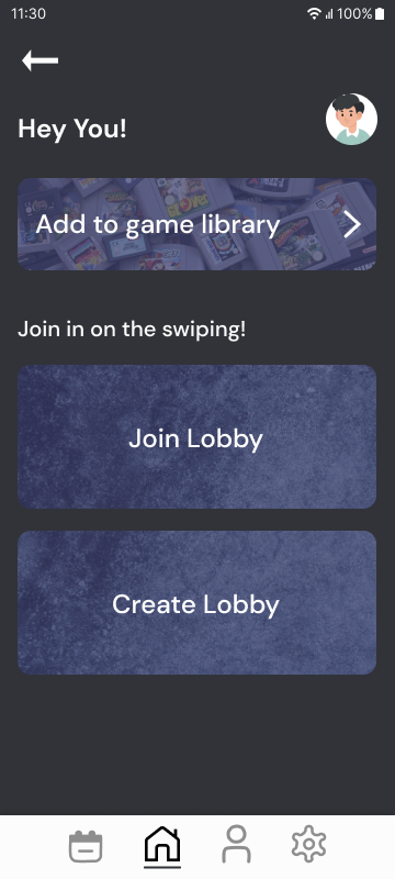
High Fidelity Wireframes
I had some trouble figuring out how I wanted the app to navigate. I decided on the swipe interaction, since it has been normalized by apps like Tinder. I thought users would be able to adapt to it quickly without too much help.
This was the final version before being sent off for usability testing.


Iterate
Usability
I decided to try out unmoderated usability testing using Maze. This made gathering participants within the timeframe easier. I gathered 6 participants and found a potential issue based on what they said.
Issue 01
Swiping may be a new feature to users so they may be confused on what to do.
A user brought up that they were thankful there were instructions on what to do because they would've just pressed the buttons instead of swiping. This brings up the issue that swiping may not be intuitive and more direction might be needed.
Solution 01
While in the process of swiping, users will see on the cards if they are saying yes or no to the game in question.
This will show the users how they are voting when they choose to swipe, so they can vote with confidence.


There are no indications of how the user is voting, so if users forget the instructions, they might become confused.

I added a subtle “yes” or “no” that appears so users know how they are voting.

Also added more information to help direct users in case of confusion.
It looks faded while swiping.
Final Prototype
Iterated Wireframe
After considering all the feedback, I revised the high-fidelity wireframe. This is the final iterated prototype
This is the working prototype of the final iterated version. If it’s hard to use, you can click the button below to go to the Figma file.
Reflection
What I learned
Color: Through this process the balance of a dark background with vibrant colors was something I struggled with. I learned how to properly use darker colors as negative space and how I could separate focal points of vibrant colors using white to counter balance the clashing colors without breaking visual hierarchy and maintaining negative space.
Navigation: Figuring out how to create a seamless design with swipe and tap navigation for accessibility was a challenge as well. I drew inspiration from apps such as Tinder and Noobly to make the interactions simple and effective, yet interactive. Tinder has normalized swipe left and right interaction, so I figured that the same features on my app will fit right in with little to no explanation being necessary.

If I had more time…
If there was more time, I would've loved to do a moderated usability test. It was interesting to explore the different data that could be collected from moderated vs unmoderated usability tests. With unmoderated testing, I feel like I'm missing more in-depth insights and follow-up information that could've been helpful to reference.

Check out my other projects :)

Ribblr
Revitalized a website to enhance user satisfaction with an intuitive browsing experience.
Project : Responsive Website
Device(s) : Desktop | Tablet
Role : UX Designer and researcher

Fair Play
Guided indecisive gamers through the process of selecting the ideal video games tailored to their preferences.
Project : End-to-End Application
Device(s) : Mobile
Role : UX/UI Designer

TikTok
Proposed a watch-party feature, fostering unique social experiences and deepening engagement.
Project : Add a Feature
Device(s) : Mobile
Role : UX Designer and researcher