

Upgraded an existing website by prioritizing user needs, creating a user-friendly and smooth browsing experience to improve user satisfaction and interaction.
Overview
What if we explore ways to help crocheters feel less overwhelmed with the navigation of Ribblr, so they are more willing to return?
Timeline
Figma, FigJam,
Google Drive,
Discord, OBS
My Role
Tools
Researcher
UX Designer
Overall: 1 Month
Research: 2 Weeks
Design & Testing: 2 Weeks
What is Ribblr?
Ribblr is an innovative platform where users can purchase and download a wide variety of craft patterns created by fellow enthusiasts. Designed with accessibility in mind, Ribblr offers features such as smart sizing, language translation, and zoom functionality, ensuring a user-friendly experience for all crafters. This platform not only provides creators with an excellent opportunity to monetize their work but also offers buyers a diverse selection of unique patterns to explore.
So what’s the problem?
The Ribblr website has a lot of design flaws and needs a usability overhaul.
There isn’t much hierarchy and it leaves users feeling overwhelmed.
There’s many features on the website that aren’t explained, so it leaves the user feeling confused.
Since there is a lot of clutter and features, it makes the website hard to load and work properly.
How do we solve the problem?
My aim was to develop a streamlined Ribblr website that ensures users feel clear and at ease, which encourages heightened user engagement and potentially boosting sales.
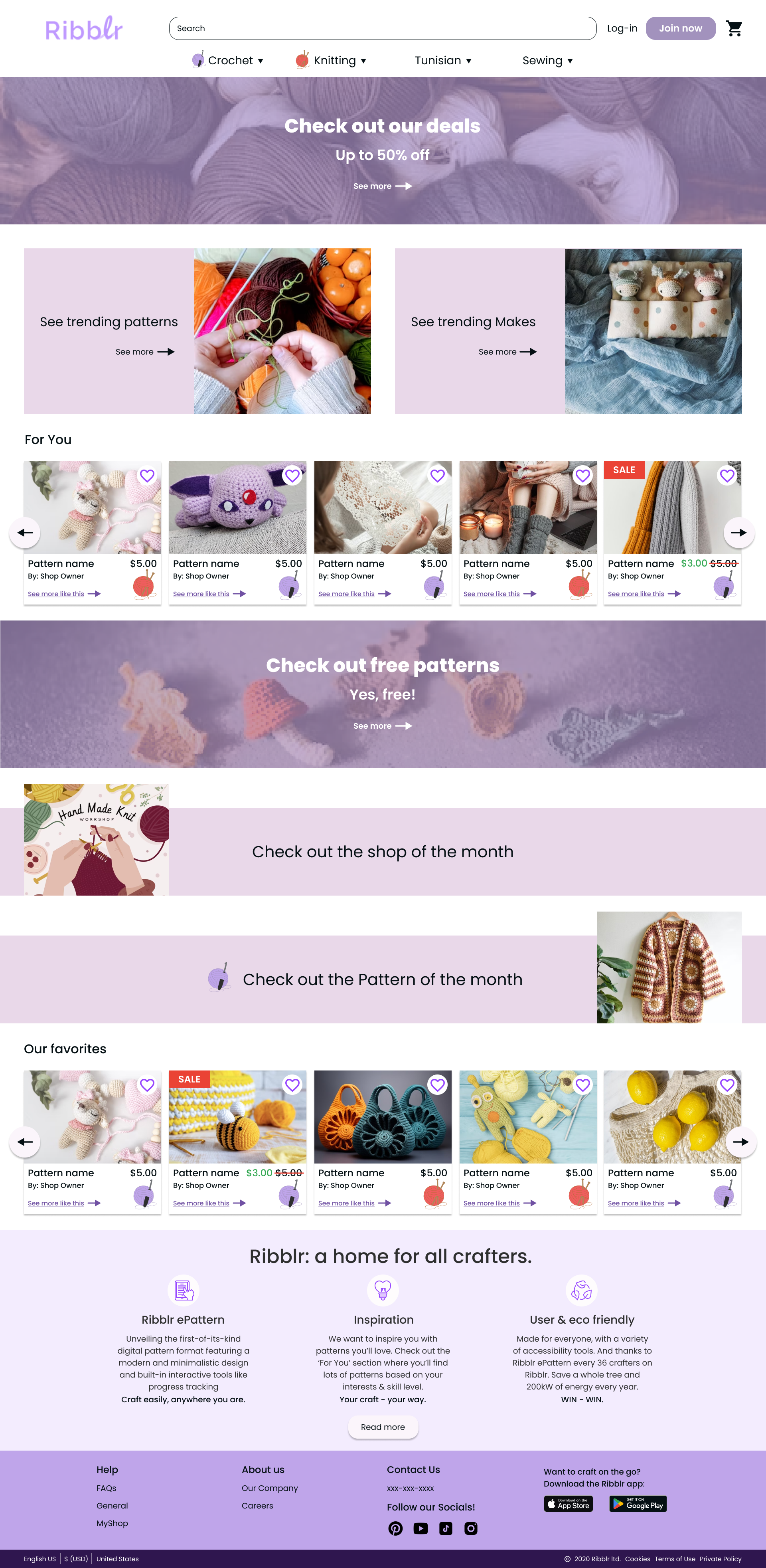
What does the website currently look like?


The homepage, after logging in.

Product Page
Determining the Goals
User
Find Patterns Easily: Users may want to quickly navigate the website to easily find crochet patterns.
Community Engagement: Users want a sense of community where they can share their projects, ask questions, and connect with fellow crocheters.
Inspiration for Projects: Users want inspiration for new crochet projects, so they want to be able to scroll through the website efficiently.
Business
Increase user engagement: encourage users to spend more time on the website by providing compelling content, interactive features, and a sense of community.
Brand authority: Establish the website as an authoritative and trusted source in the yarn craft market. This can lead to more recognition within the crafting and DIY community.
Discovery
Research
Goal
I want to know how users feel about the current Ribblr website, and what would increase the usability of the website.
Objectives
Determine if yarn crafters purchase patterns online.
Determine if users have difficulty navigating Ribblr to see if a redesign is necessary.
Understand what users look for in a crafting website.
Identify any road blocks that prevents users from making purchases.

How might we help yarn crafters feel less overwhelmed, while still keeping all the necessary features that will encourage users to return?
Survey
To gauge the public’s general opinions and feelings about Ribblr, a survey was conducted. 4 yarn crafters submitted answers and these are the insights:

While exploring the website, 67% users claimed that there was noticeable lag, and slow loading speed.
When asked, 100% said navigation could be improved, especially if there was more order in the placement of features.
All users had difficulty navigating the website.
All users think the website would improve if there was less content on the page.
Interview
To get more detailed feedback, interviews were conducted virtually with 6 yarn crafters. They were instructed to navigate the website with no additional instruction other than the given task. Questions were formulated with research objectives and survey data in mind and was asked after the tasks were completed.
These are the resulting insights:

It was discovered that 83% of users claimed that the Ribblr website was hard to navigate.
At least 5 verbally expressed confusion and feeling overwhelmed over how busy the website is.
The filter function was glossed over in each interview.
One individual claimed annoyance over being forced to make an account to make purchases.
Define & Ideate
For the users
Who are they?
To help define users and see their perspectives, a persona was created. This helped me grounded and focused on what real users want/need.

Meet Liana, the crochet dabbler
What features do they want/need?
Adding Hierarchy
Adding hierarchy should help reorganize elements and create a more concise experience. This should help users feel more clarity and no longer overwhelmed.
No Infinite Scrolling
With infinite scrolling, the website gets overloaded and becomes slow to load. Adding set pages will allow the website to load smaller amounts at the time, allowing for lessened server load.
Filter System
Previously, the filter system was hard to find and most people in the user interviews didn’t notice it at all. This made it harder for users to find a pattern they were looking for.
How would they get there?

To help contextualize the potential paths the user could take, I made a user flow. This aided in the visualization of what screens needed to be created and the main focus of each.
Initial Design
Wireframes
Low Fidelity Wireframes
When creating the wireframe, the main focus was on desktop. This was because I had gathered most of my data based on users navigating the website on their computers. However, since the website can be accessed from mobile and tablet, I also made a few tablet screens to simulate the responsiveness of the original product.
This is the deskop version


This is the tablet version


UI & Component Library
A lot of time was spent trying to work around the original website’s color scheme. I had to make some changes based on the original colors not meeting accessibility standards.
Since the color pallet was mostly monochromatic, the hierarchy came from sizing, space, and proximity. To dissipate some lingering confusion, I created custom icons that allow users to determine what craft classification each pattern is.

High Fidelity Wireframes
After completing the component library, it was smooth sailing. I proceeded to make two versions of the website to showcase responsivity.
This is the desktop version


This is the tablet version


Testing
Usability
After prototyping the hi-fi wireframe, it was sent to 3 people for a moderated usability testing.

Task completion rate: 100%
Error Rate:
Browse homepage - Some errors
Users did not enjoy some aspects of the homepage like how it was grouped or spaced.
Looking for pattern - No errors
Purchasing a pattern - No errors
User difficulty rating (1-10, 10 being the hardest):
Browse homepage: 2.83
Looking for pattern: 2.83
Purchasing a pattern: 1
Iterate
Fixing Issues
The main issues that were found during the usability tests:
Issue 01
Users expressed distaste for how the content was grouped, and wanted related things together.
1 user vocalized this issue, but another participant had a bit of trouble finding what they wanted. The participants also had issues with some of the spacing of items on the homepage.
Solution 01
Clean up and re-organize the homepage a bit.
During the testing, I asked the users with issues what they wanted to see grouped and used the feedback to help reorganize. Ideally, a card sort would’ve been helpful, but there wasn’t enough time.


1 user had a problem with only two of the headers having an icon, and not all.
Another user had an issue with the drop down arrows, since there was no drop down options.
Users thought that the “trending patterns” section was not as important as sections such as “for you” or “free patterns”
One user had a slight problem with how the “shop of the month” section looks/was spaced.


I added new icons and got rid of the drop down arrows to lessen user confusion and dissatisfaction.
I re-prioritized all the features in order of what the users wanted to see.
I redesigned the “pattern of the month” section since it wasn’t very favored during the usability testing.
Final Product
Iterated Wireframe
After taking all the feedback into consideration, I went back and made iterations on the high fidelity wireframe. This is the final iterated prototype:
This is the working prototype of the final iterated version. If it’s hard to use, you can click the button below to go to the Figma file.
Reflection
What I learned
This case study was my first attempt at a redesign project. There were constraints in place that made the job seem really intimidating at first, but I came out of the project learning a lot. I pondered for a while on how to create a simplified user experience with constraints in mind. I realized that they weren't obstacles in my way, but a chance to think outside of the box and innovate. This new perspective made this case study challenging yet fun and it's something I hope to carry with me into future case studies.
I also had to utilize the power of prioritization, since there were so many features plus a tight deadline. I learned to focus on the essential elements to help simplify the original design, but also to improve the user experience.

If I had more time…
If I had more time, I would like to have done a card sort. This would've helped me determine how users would like the homepage would be organized instead of just guessing. This may have helped to avoid some critiques I got during usability testing.
I should have scouted out people to interview ahead of time. I had a difficult time meeting deadlines, because I didn't get the interviews done in time. There were various reasons for this, but I now know to prepare ahead of time to account for road bumps.

Check out my other projects :)

Ribblr
Revitalized a website to enhance user satisfaction with an intuitive browsing experience.
Project : Responsive Website
Device(s) : Desktop | Tablet
Role : UX Designer and researcher

Fair Play
Guided indecisive gamers through the process of selecting the ideal video games tailored to their preferences.
Project : End-to-End Application
Device(s) : Mobile
Role : UX/UI Designer

TikTok
Proposed a watch-party feature, fostering unique social experiences and deepening engagement.
Project : Add a Feature
Device(s) : Mobile
Role : UX Designer and researcher